Color Preferences by Room According to Pinterest
I have an little bit of an odd Decorating Tuesday for you- when I stumbled across this (Colour and Space) I was so excited about it I had to share. Colour and Space is a project by designers Mie Frey Damgaard and Peter Ørntoft for decorative paint brand Jotun (Turkey).They have been examining pinterest boards (currently in Turkey only mind you) and analyzing only two (but basic and very powerful) categories: color and location. The results are placed into not-so-simple pie charts, showing preferred colors in places around the home like kids’ rooms (the faintest pink), living rooms (maize), and kitchens (white).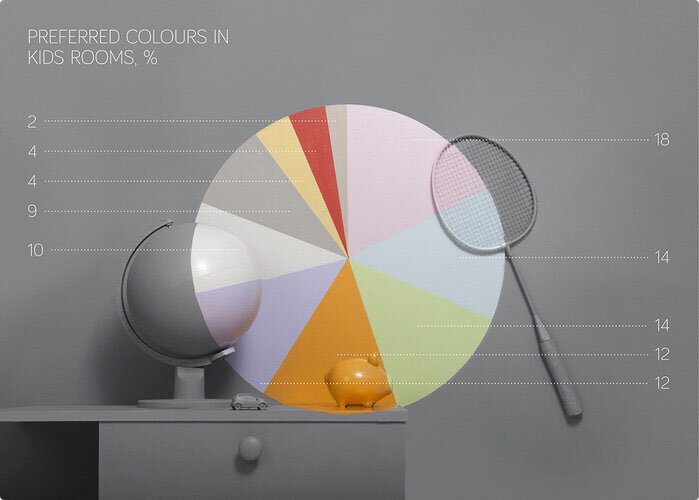
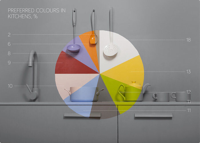
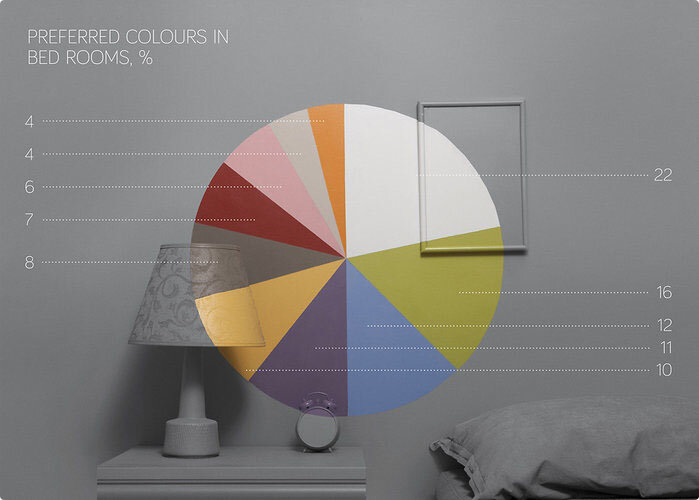
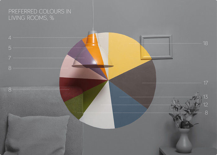 Do keep in mind that if you are not from Turkey these charts aren't specifically accurate as color preferences vary greatly from region to region. The visual is just too cool thought to not be interested even if you are a Turkish resident. :)Colour and Space by Jotun Türkiye from jotunturkiye on Vimeo.lovely sources: found on Co.Design // project designed by Mie Frey Damgaard and Peter Ørntoft for decorative paint brand Jotun